Responsive Images
Images account for a large portion of a webpage’s overall weight, or size of the page’s download, as compared to JavaScript, CSS, or HTML. If these images aren’t optimized, then they can drastically slow down the time it takes to download and render the page. As we know, the longer it takes to download pages, the larger the chance our users will leave the page in frustration.
So how can we best optimize our images for the web?
The bare minimum
If you do nothing else, one of the easiest methods is file compression.
Often, original images (i.e. stock photos, taken on digital cameras) are uncompressed which means they are way larger than they really need to be. Apps like ImageOptim allow you to simply drag and drop your images and I’ve seen filesizes decrease upwards of 60-85% or more.

But even the best compression might not help enough if you’re using an image that is too large.
When we use images downloaded directly from a stock photo site, or taken straight from a digital camera, and use them on the web, the image is way larger than it’s being displayed at, which means it takes the user longer to download and display the image.
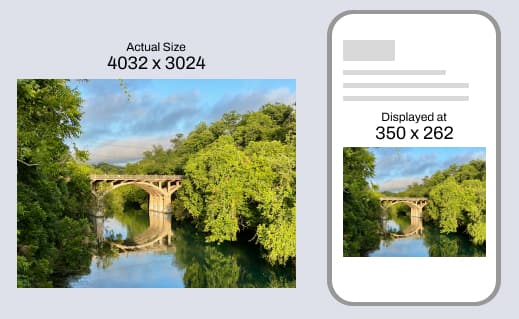
All of those extra pixels in the original file are essentially being wasted because we won’t see them in the webpage. So the next best thing to do is resize the image to the proper size. What is the proper size for the web? That depends.
A good rule of thumb, especially with responsive websites, is to look at the largest size the image will be displayed at, and resize your image to match. If the image is fullscreen, like in a hero banner area, then I ususally cap it at around 1440px wide. It's a balance of image quality and overall download size.
But, we can do better
Even if we resize our image and compress it, we can still do more to make the webpage download the right image assets faster. That’s where Responsive Images comes in.
The <picture> element
The picture tag in HTML gives us a lot of flexibility and power when it comes to providing the right image for the job. We can provide optimized images to the browser, perform art direction on the image, or serve more modern image formats.
Optimized Images based on device & art direction
The picture tag gives us the ability to declare multiple versions of the same image which then allows the browser to best decide which one to display
For example, we might have a photo of a Siberian Husky at 1440px wide.
<img src="husky-large-1440.jpg" alt="Photo of a Siberian Husky">
But we know that is way too large for mobile devices. So, we make a copy of this and scale it down for smaller screens, say at 768px wide.
This is where the <picture> tag comes in. It allows us to declare both images and when to use them. In the code below, we have our original <img> that calls for the smaller photo and we’ve used the <source> tag to request the larger image but only when the media attribute is met. In this case, it's a breakpoint, much like in CSS.
<picture>
   <!-- Larger image for screens 768px and wider -->
   <source srcset="husky-large-1440.jpg" media="(min-width:768px)">

   <!-- Smaller image for screens 767px and narrower -->
   <img src="husky-small-768.jpg" alt="Photo of a Siberian Husky">
</picture>
So, if the browser screen is 768px wide, or larger, use the large photo. Else, use the smaller photo. The browser is now serving up images that more closely match the size at which the image is displayed at, thus optimizing the speed performance on the page.
This method also allows us to do some art direction with the photo. On larger screens the photo of the dog, playing in a park, might work, but when scaled down to the size of our phone the dog gets really small. Using this method, we could use a different cropping of the photo so the dog is larger and easier to see.
Modern Image Formats
The other really great benefit of the <picture> element is the ability to serve more modern image formats that are going to be smaller filesizes yet still retain the image quality. Examples of these are WebP and AVIF.
We don’t want to serve these images up alone, though. At least not yet. There is still a chance that someone might be using a browser that does not support these formats yet. Altough they are already supported quite well.
To add on to our example above, we’re going to let the browser know we also have these images in the WebP format.
<picture>
   <!-- ADDED: Larger image for screens 768px and wider, and devices that support WebP image format -->
   <source srcset="husky-large-1440.webp" media="(min-width:768px)" type="image/webp">

   <!-- Larger image for screens 768px and wider -->
   <source srcset="husky-large-1440.jpg" media="(min-width:768px)">

   <!-- ADDED: Smaller image for screens 767px and narrower, and devices that support WebP image format -->
   <source srcset="husky-small-768.webp" type="image/webp">

   <!-- Smaller image for screens 767px and narrower -->
   <img src="husky-small-768.jpg" alt="Photo of a Siberian Husky">
</picture>
The browser will now look at both the device’s sceen width and it’s ability to use WebP before deciding which image to serve up.
This is a very simple example, and in practice you might want to add more image sizes to account for all the different screen sizes in the real world.
Below are some great resources that will help you do this: